


Choosing the right shades for a home can significantly influence its overall ambiance. With over 40 years of professional experience in restoration and colour-matching consulting, experts have noted that most domestic decor decisions are made by women. This insight highlights the importance of understanding colour perception.
Interestingly, studies reveal that only one in 200 women is colour-blind, compared to one in ten men. This biological difference can impact how colours are perceived, making it essential to consider these factors when decorating a house.
This guide will explore the art of selecting paint shades by balancing personal taste with practical design realities. While personal preference is crucial, the technical aspects of colour selection remain paramount for a successful home project. Understanding these nuances can help avoid common mistakes during the planning phase.
Key Takeaways
- Colour choices greatly affect a home’s atmosphere.
- Most decor decisions are made by women, reflecting their unique perspective.
- Colour perception varies significantly between genders.
- Balancing personal taste with practical considerations is vital.
- Technical knowledge enhances the success of home decorating projects.
Understanding the Role of Light in Interior Paint Selection
The interplay of light and colour is crucial in setting the mood of any space. The type of light in a room can significantly alter how colours are perceived. Understanding this relationship is essential for making informed choices.
The Impact of Natural Light
Pale shades are highly effective because they reflect around 80% of natural light. This makes them ideal for small rooms that lack sufficient daylight. In contrast, dark colours reflect only 10% of light, which can dramatically change the atmosphere when natural light is limited.
Artificial Light and Colour Perception
Modern LED artificial light offers a broader wavelength range than older incandescent bulbs. This shift changes how colours appear in different lighting conditions. It is vital to consider how lighting interacts with your chosen colours throughout the day.
| Colour Type | Light Reflection | Best Use |
|---|---|---|
| Pale Shades | 80% | Small rooms |
| Dark Colours | 10% | Large spaces with ample light |
| Neutral Tones | Varies | All-purpose |
Proper lighting assessment is a fundamental step in design, as the same shade can appear vastly different depending on the time of day. This understanding ensures that the final result meets expectations.
How to Choose Interior Paint Colours for UK Homes
With an astonishing 15,000 whites available, selecting the right one can feel daunting. A structured approach simplifies this process, making it more manageable.
Most paint companies offer a curated selection of popular whites, covering the three primary colours in the visible spectrum. This limited range helps streamline choices.
When painting a house, keeping a pure vivid-white swatch handy is beneficial. This reference allows one to discern subtle differences in tones.
If a specific colour catches your eye, request your mixer to identify the pigments in the formula. This step reveals the fundamental hue before it is lightened.
Patience is key when selecting paint. The vast array of options can lead to decision fatigue, so taking time to explore choices is essential.
Evaluating Colour Schemes and Sample Testing
The right combination of colours can transform the essence of any room. Evaluating colour schemes requires careful consideration and practical testing. Using sample pots is an effective way to see how a colour interacts with your specific environment. This method is far more reliable than relying solely on digital images.
Interestingly, a $12,000 German colour-matching device was once rendered ineffective due to the texture of a tile. This incident highlights the importance of manual intervention in achieving the correct result. In one case, it took 11 steps to match the desired shade for a bathroom tile.
When you test paint, observe the samples in both morning and afternoon sunlight. This practice helps avoid the risk of selecting a shade that may appear different under varying light conditions. Finding the right paint often involves trial and error, but using physical samples is the best way to ensure the final finish aligns with your vision.
Managing Colour Overload and Personal Preferences
Overwhelmed by the multitude of shades, many struggle to make a decision that reflects their personal style. This challenge can be particularly pronounced when the nesting instinct drives expectant parents to redecorate. It’s essential to manage this urge to avoid unnecessary stress.
To ease the decision-making process, start by selecting just three whites for the walls of your house. This approach narrows down choices and helps maintain focus.
If postponing the project isn’t an option, opt for low VOC products. Ensuring proper ventilation is crucial to keep the air clean and safe during the painting process.
Expert advice suggests taking a step back during the day when feeling overwhelmed. This simple act can provide clarity and help you reassess your options without the pressure of immediate choices.
Expert Advice and Insider Tips
Expert insights can dramatically enhance the decision-making process in home design. The renowned Criss Design offers valuable guidance that highlights the uneven distribution of taste and decorating talent among those embarking on renovations.
During the 2023 season of The Block, Criss shared the challenges contestants faced in matching complex colours under tight time constraints. This experience underscores the importance of having a well-thought-out plan when selecting shades.
Innovative ideas from Criss often involve looking beyond the surface. Understanding how pigments interact can lead to a truly unique design outcome. Seeking professional guidance allows homeowners to tap into years of experience, ensuring a polished result.
Mastering the nuances of colour application takes time and practice. However, this skill is essential for creating a cohesive and beautiful home.
| Aspect | Details |
|---|---|
| Expertise | Criss Design’s professional insights |
| Challenges | Time pressure in colour matching |
| Innovation | Understanding pigment interactions |
| Outcome | Achieving a polished result |
| Skill Development | Mastering colour application |
Considering Paint Finish and Type
The choice of paint finish plays a pivotal role in how colour is perceived in any environment. Selecting the right type can greatly enhance the overall design of a room.
High-quality paints typically contain 30% to 45% binder and pigment. This composition ensures a superior finish and better durability for interior walls.
Oil-based paints are often reserved for areas subject to heavy wear. However, they can take up to 24 hours to dry completely, which may affect project timelines.
In contrast, water-based paints are generally kinder to the environment and contain fewer VOCs. This makes them a safer choice for most design projects.
Choosing the right finish, such as matt or gloss, can transform the look of your shades and grey tones. It alters how they reflect light, impacting the room’s overall atmosphere.
Always check the VOC content of your paints. This is crucial for ensuring the safety of your household, especially in frequently used rooms.
Incorporating Interior Design Trends
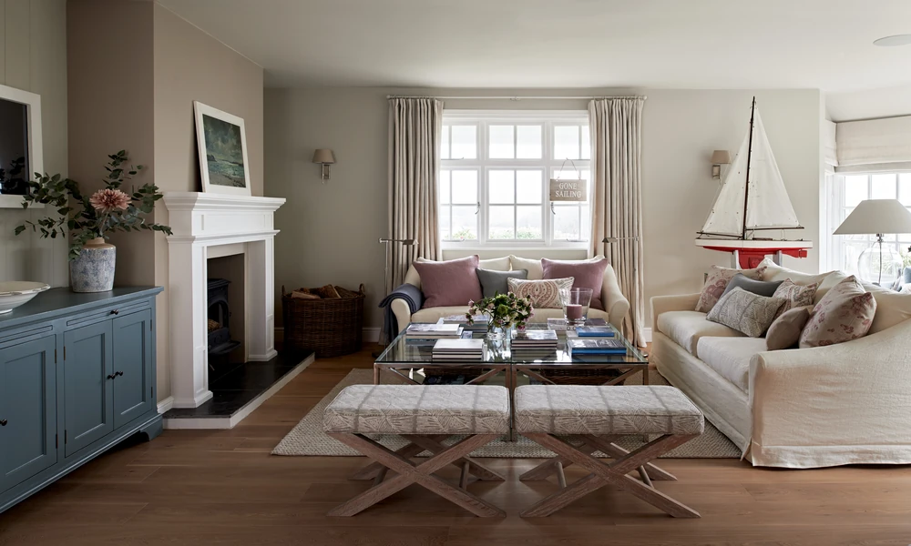
Employing light-reflective shades is essential for crafting inviting and spacious environments. Most individuals favour subtle hues and wall colours that enhance natural light, making small spaces feel larger.
Modern interior design trends often emphasise the use of neutral shades. These colours create a calming atmosphere, allowing other room elements to shine. When applying these tones to walls, it is crucial to consider the texture of the surface. This factor can significantly affect the final appearance of the paint.
Subtle colour palettes are a timeless choice. They can be easily updated with accessories, ensuring your home remains stylish for years. By focusing on light-reflecting shades, you can create airy and inviting spaces that feel both modern and comfortable for all occupants.
“The right colours can elevate the design of any room.”
Adapting Your Choice for Different Spaces
Understanding the purpose of each space can guide the selection of suitable tones. Each area in a home serves a unique function, and the right colours can enhance its atmosphere.
Optimising for Living Rooms
When considering living rooms, warm colours often create a snug and inviting feel. In contrast, cool colours can make a room appear more spacious. Choosing shades that promote relaxation is key for this communal area.
Customising for Unique Rooms
Unique rooms require a tailored approach to wall colours. The purpose of each room dictates the atmosphere you wish to create. For example, vibrant tones may energise a playroom, while softer shades can soothe a bedroom.
Always test your paint on the walls of the specific room. The light and purpose of the space will significantly influence the final result. A well-considered grey or neutral palette can serve as a versatile backdrop, allowing for personal decor to shine.
Conclusion
The journey of selecting the ideal hues can profoundly shape the character of any dwelling. This guide has provided essential steps for ensuring your home project is a complete success.
By following the expert advice from Criss Design, one can confidently navigate the complex world of shades, grey tones, and various paint finishes. Remember that testing your chosen colours in different lighting conditions is crucial to ensure the result works well in your specific spaces.
Whether decorating living rooms or unique rooms, understanding the purpose of each space is key to selecting the perfect paint colour. With the right tools and a clear plan, transforming your house into a vibrant home that reflects personal style and taste is achievable.